Shine Art Festival 2025

A modular typeface grown into a festival identity.
Shine Art Festival 2025

Typography Design

Exhibition Identity

Year

2025

Description

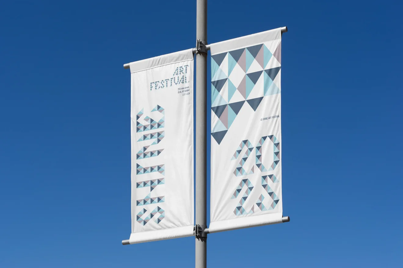
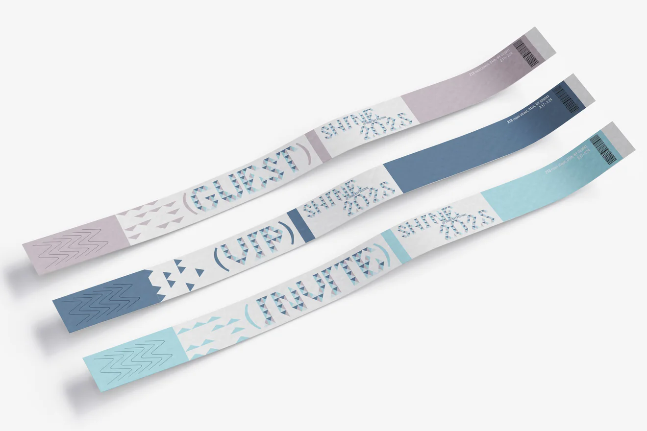
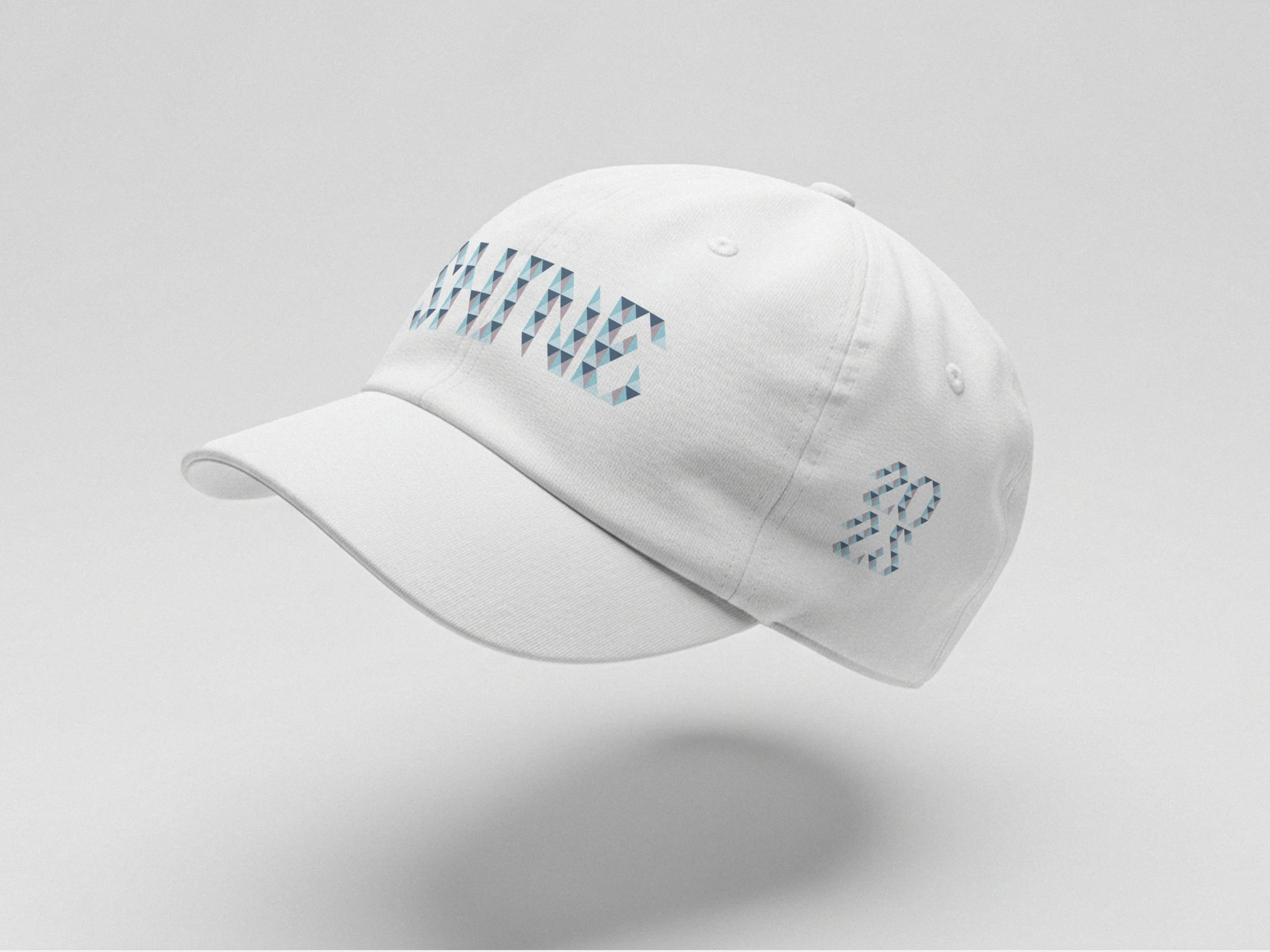
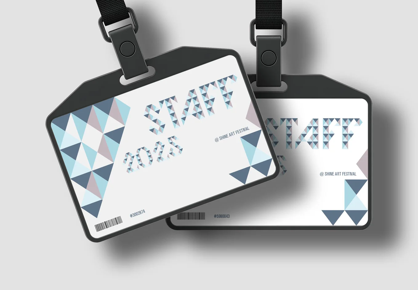
I used the triangle as the single repeating component, building each letter from a consistent geometric unit. Working with a fixed grid allowed the form to develop through arrangement rather than drawing, which emphasized structure, rhythm, and the relationship between positive and negative shapes. The sharp angles and repeated diagonals created a visual language that feels crystalline and faceted, while the limited palette of cool tones helped soften the complexity of the forms. As the alphabet grew, the modular system revealed how much variation can be created through rotation, mirroring, and clustering of the same simple shape. The modular typeface became the foundation for the visual identity of the Shine Art Festival 2025. By applying both the letterforms and the triangle motif across banners, wristbands, hats, and staff identification cards, the system created a consistent and memorable festival experience. The repeating triangular pattern worked well at different scales and added energy to the brand, while the typeface carried the same geometric voice throughout the materials. The identity showed how a modular alphabet can expand into a full design system with clarity and cohesion.

Problem

From a Module to an Exhibition

Adapt a modular typeface into a full exhibition system.

Solution

One Triangle, One System

The triangle-built letterforms and motif extend across banners, wristbands, hats, and staff identification cards at every scale.
s_wri

A coherent typeface can emerge from strict constraints, and modularity produces both unity and variation.
s_hat
s_bad

More Works

Shine Art Festival 2025

A modular typeface grown into a festival identity.

Shine Art Festival 2025

Typography Design

Exhibition Identity

Year

2025

Description

I used the triangle as the single repeating component, building each letter from a consistent geometric unit. Working with a fixed grid allowed the form to develop through arrangement rather than drawing, which emphasized structure, rhythm, and the relationship between positive and negative shapes. The sharp angles and repeated diagonals created a visual language that feels crystalline and faceted, while the limited palette of cool tones helped soften the complexity of the forms. As the alphabet grew, the modular system revealed how much variation can be created through rotation, mirroring, and clustering of the same simple shape. The modular typeface became the foundation for the visual identity of the Shine Art Festival 2025. By applying both the letterforms and the triangle motif across banners, wristbands, hats, and staff identification cards, the system created a consistent and memorable festival experience. The repeating triangular pattern worked well at different scales and added energy to the brand, while the typeface carried the same geometric voice throughout the materials. The identity showed how a modular alphabet can expand into a full design system with clarity and cohesion.

Problem

From a Module to an Exhibition

Adapt a modular typeface into a full exhibition system.

Solution

One Triangle, One System

The triangle-built letterforms and motif extend across banners, wristbands, hats, and staff identification cards at every scale.

s_wri

A coherent typeface can emerge from strict constraints, and modularity produces both unity and variation.

s_hat
s_bad

More Works